Drawing with Data
World Map of Population Density with Snowflakes


The Singapore-ETH Centre encompasses research programmes that address the challenges of modern societies worldwide, in urban environments and beyond.
For the season's greetings card, I created a visual concept that combines the scientific theme with the festive occasion: each country is represented by a snowflake. The resulting map is a visualisation of UN data scraped from Worldometers. Population size corresponds to snowflake size.
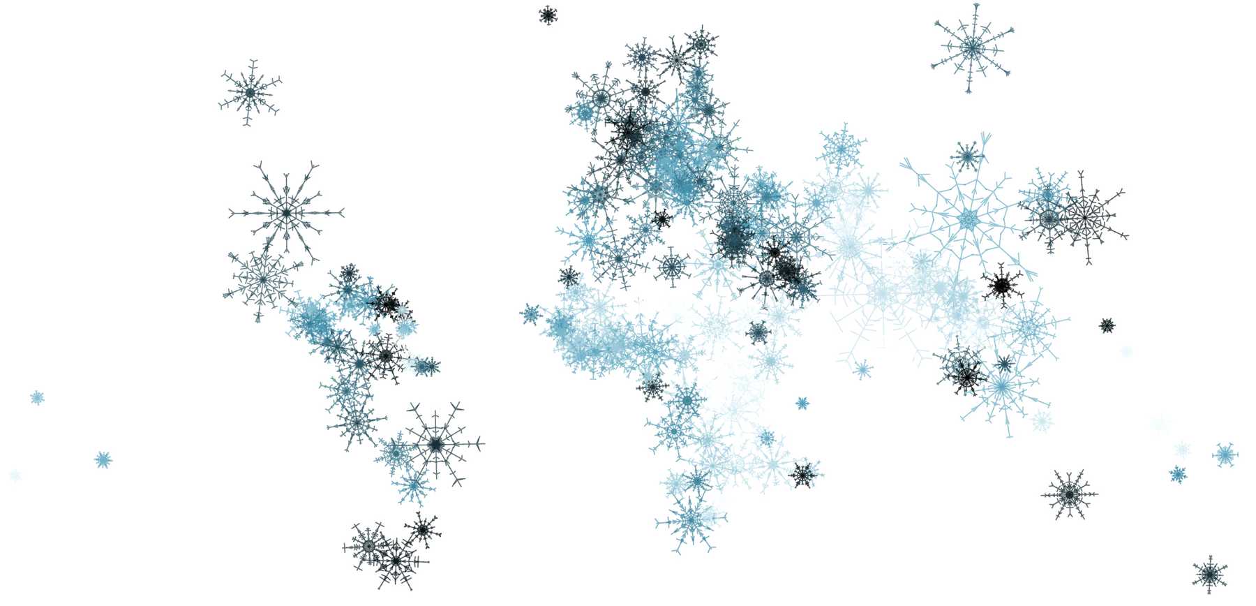
Different data is used each year: for the first edition, hue is determined by percentage of urban population – the darker the colour, the more urban the country. For the second edition, the colour reflects the density of the population – darker colour corresponds to more densely populated countries. The graph is coded in D3, with the kind help of Sergio Ordóñez for the snowflake logic.
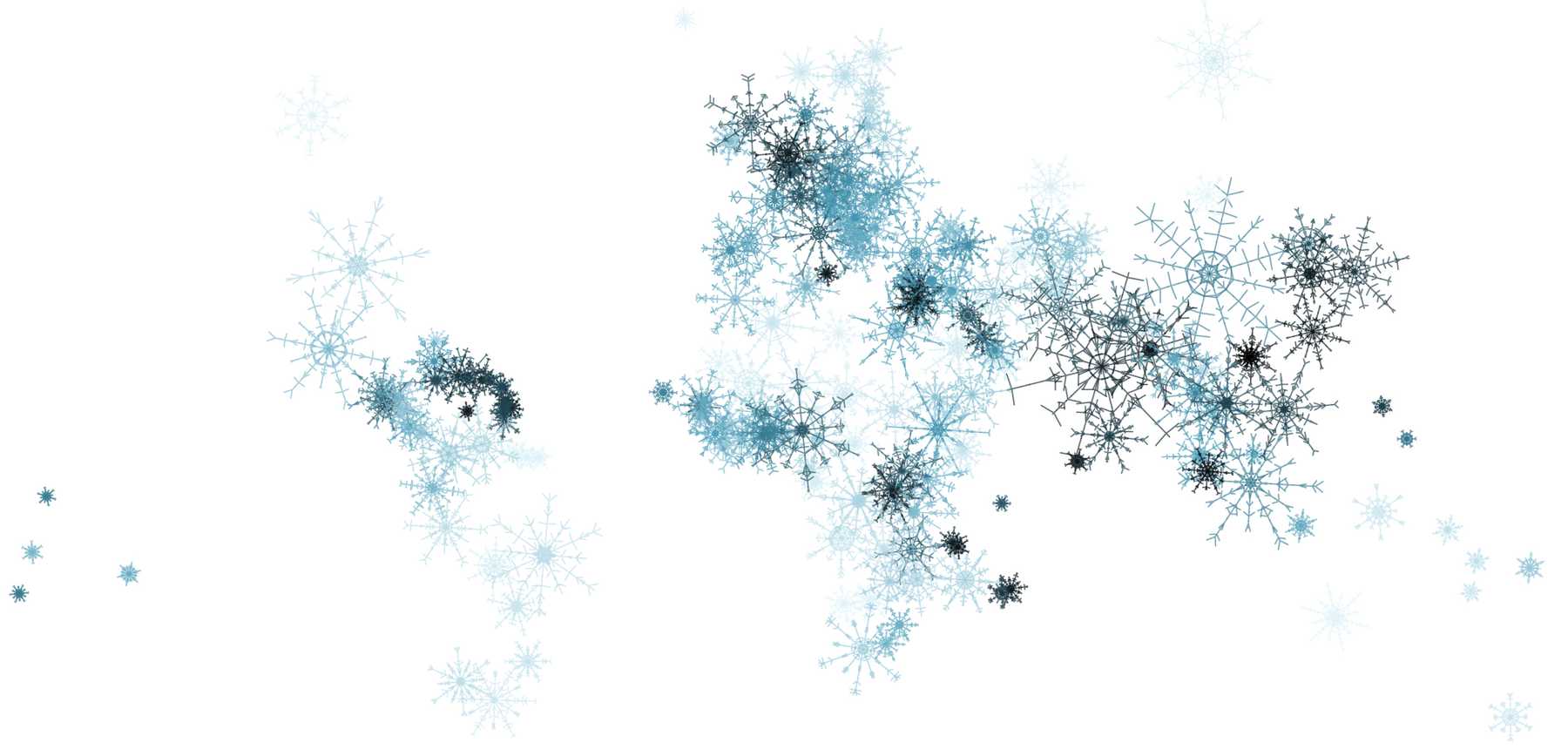
Below is an example where the colour reflects the fertility rate – with darker snowflakes representing more children. Using random parameters for snowflakes, each is unique.
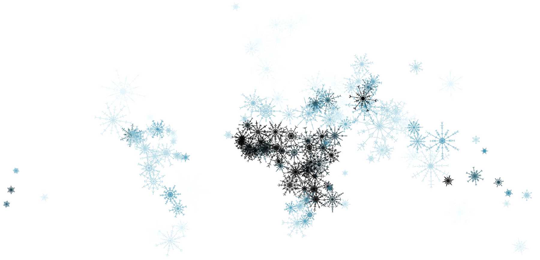
In each version, but also in comparisons within the series, data stories are revealed. Below is a version with hue that reflects ageing societies. Darker snowflakes represent a higher percentage of people over 60. It is almost the exact opposite of the fertility rate version.
More projects: