Association Bethlehem University
Paths to Education: New Identity for NGO


ABU (Association Bethlehem University) is an NGO supporting Bethlehem University since 1976, providing Palestinian youth with quality education in a peaceful environment.
Erika Burri, the then managing director, asked me to design their new identity and some fundraising materials. To be part of the project from the beginning was a great opportunity. Working closely with Erika, who was also responsible for writing the content, I was able to develop the products so that the content blended seamlessly with the design.
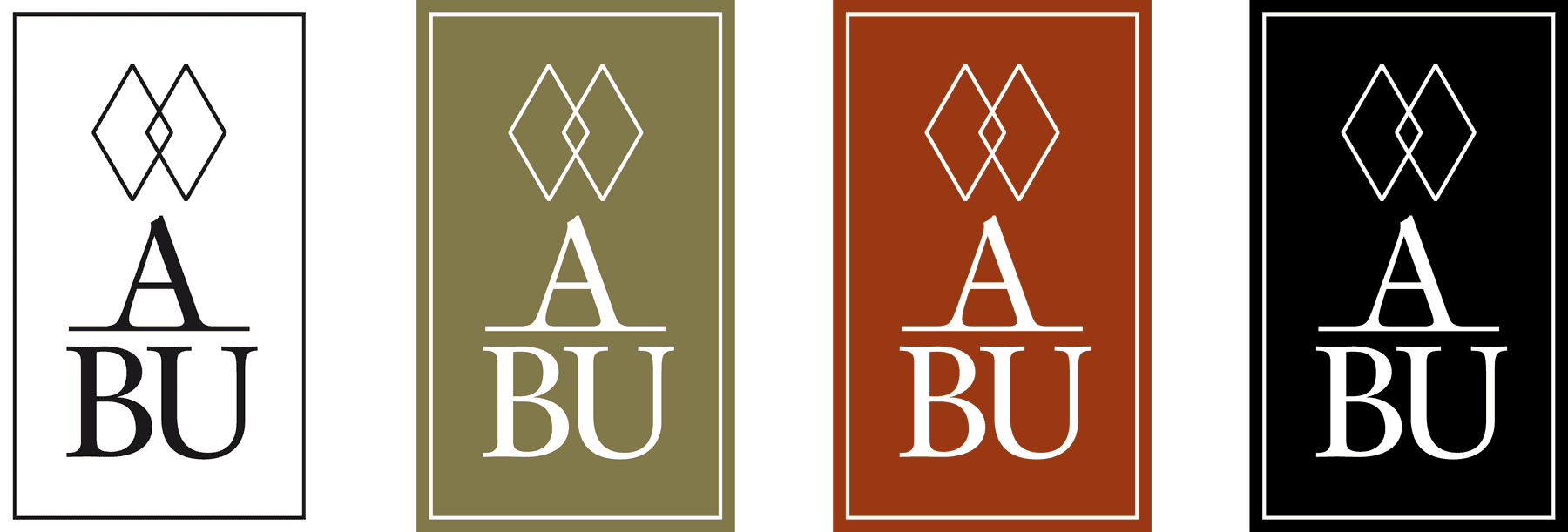
The logo features two intertwined diamonds, derived from Bethlehem University’s logo of three upward triangles.
The diamonds ‘fill in the blanks’. They metaphorically represent partnership – with the university, between students, but also between the two countries of Israel and Palestine.
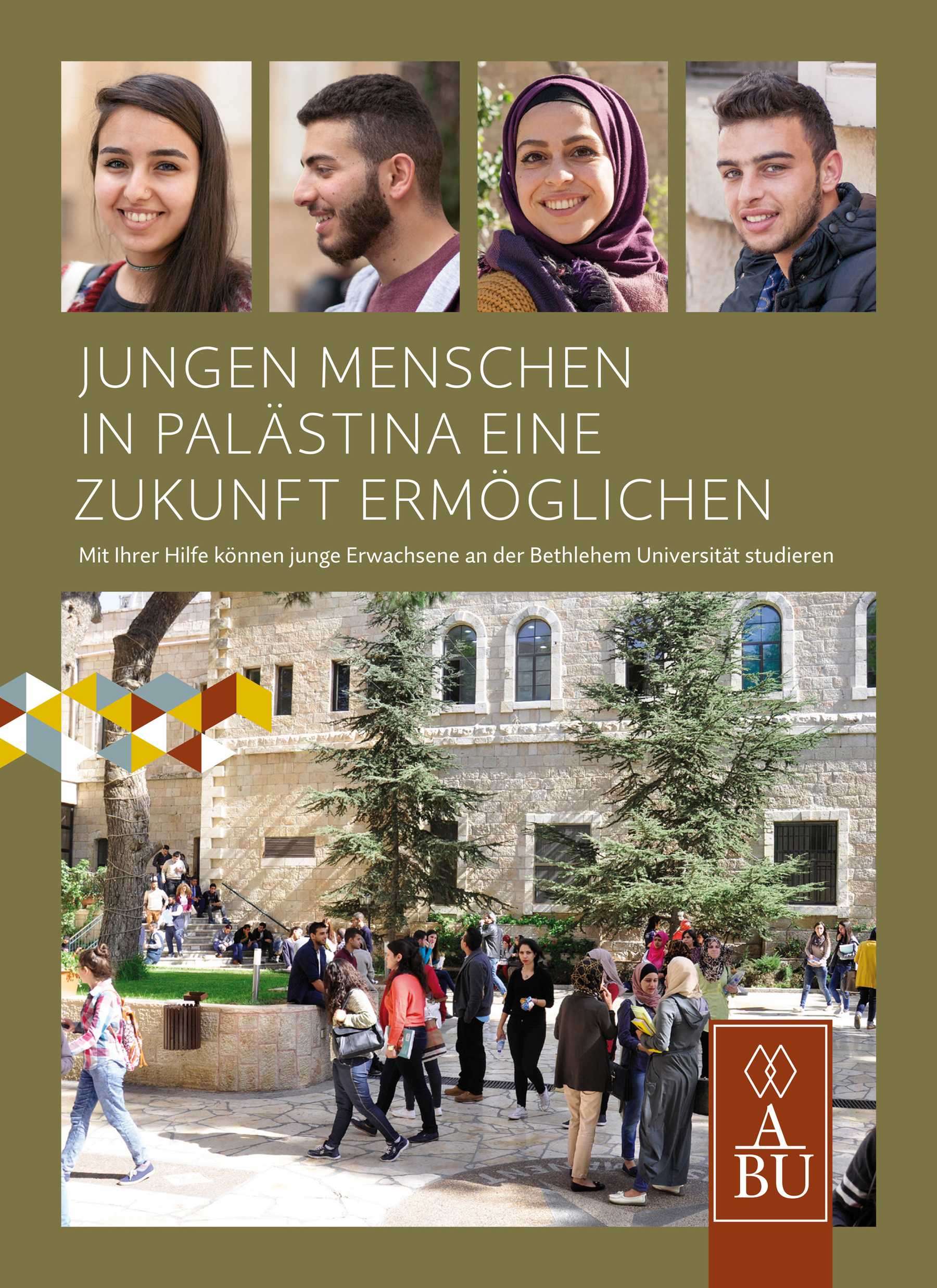
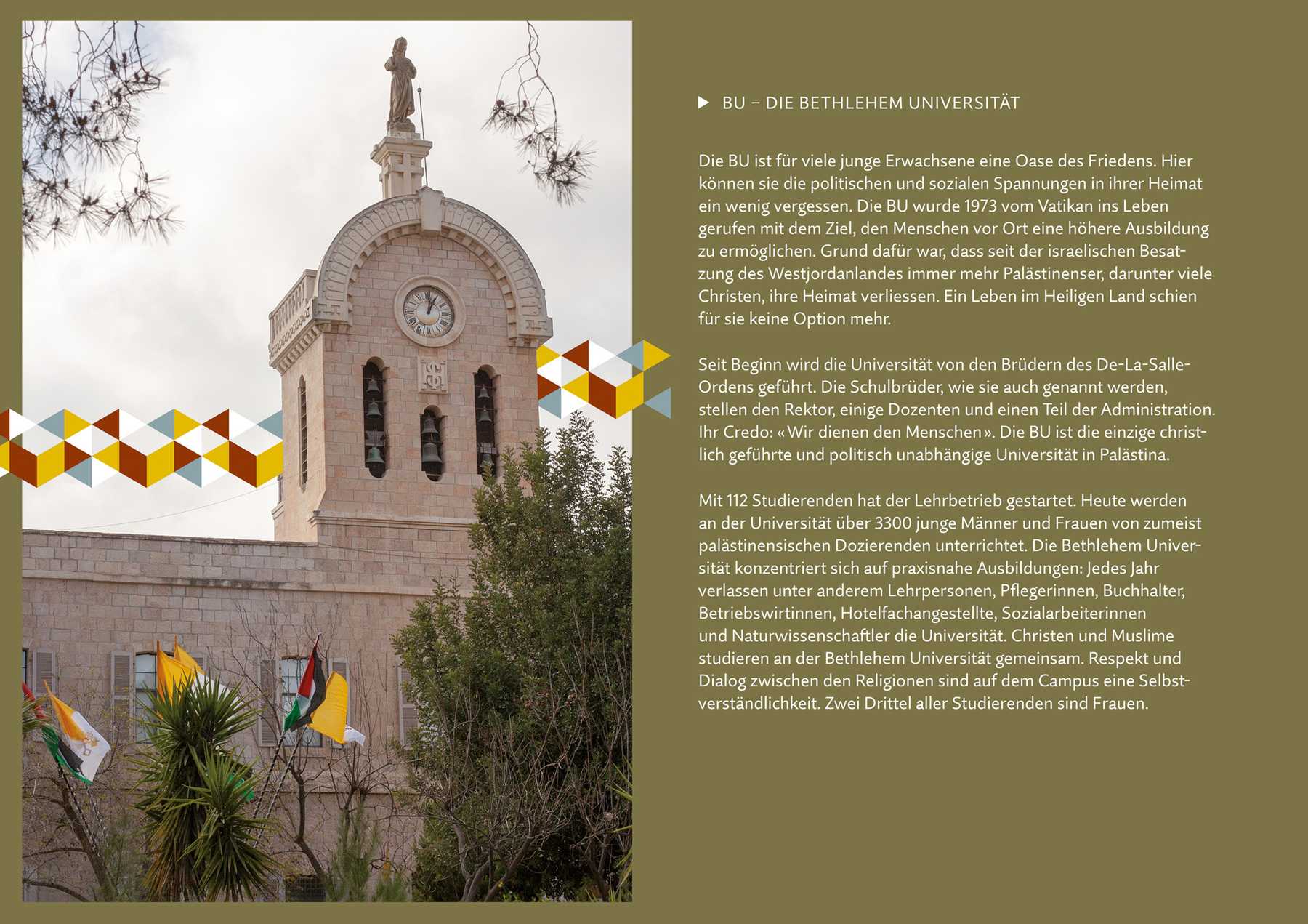
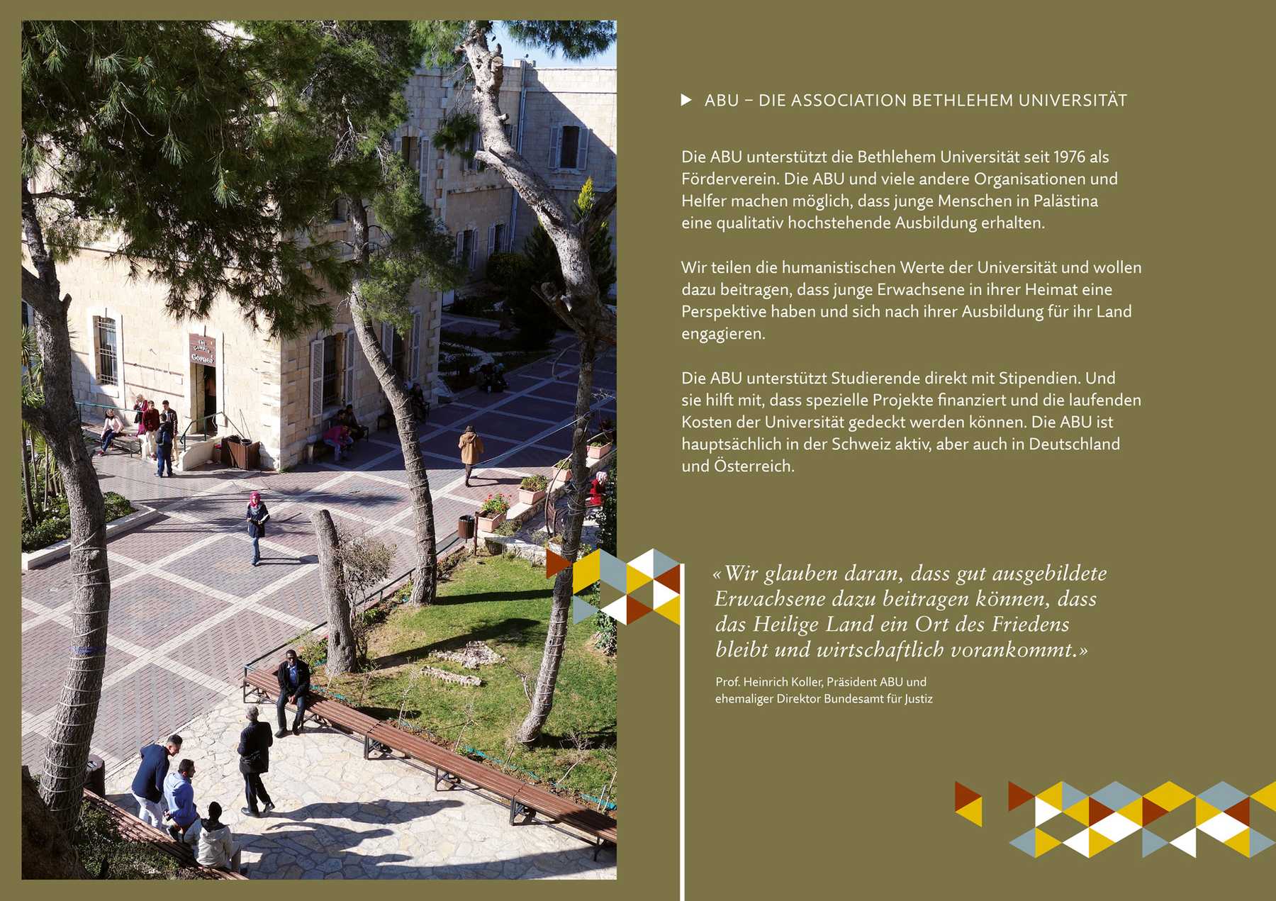
An eight-page brochure provides information about the Association’s activities and the impact of getting involved. The logo is used playfully as a colourful element. Inspired by the barren landscape reflected in the Palestinian flag, the main colours are olive and burgundy.
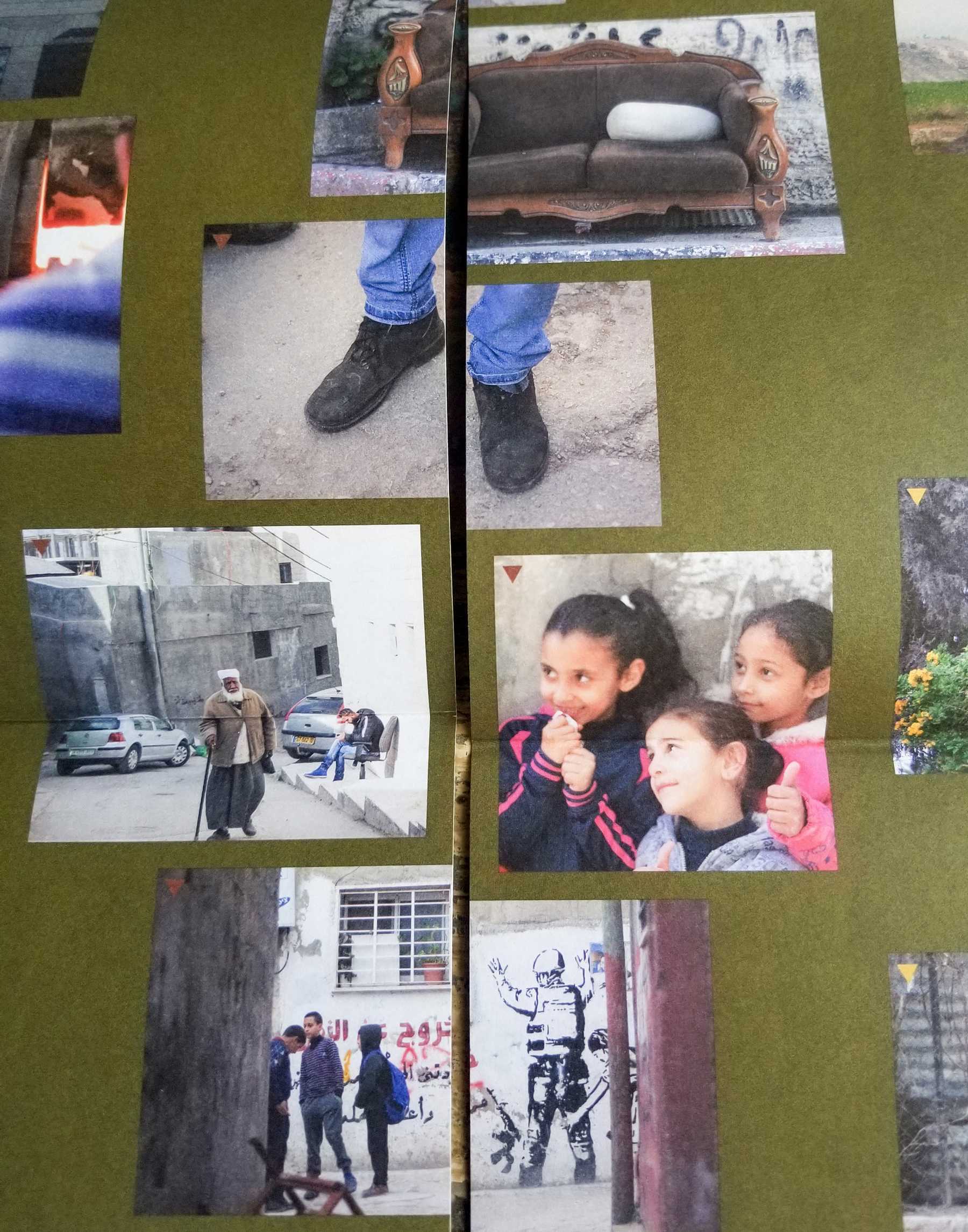
Thanks to the special folding technique with centre cut, the brochure is a poster on the reverse. It is only visible when fully unfolded.


We carefully briefed three students and equipped them with cameras to document their daily ‘journey to education’ in order to capture images for the poster.
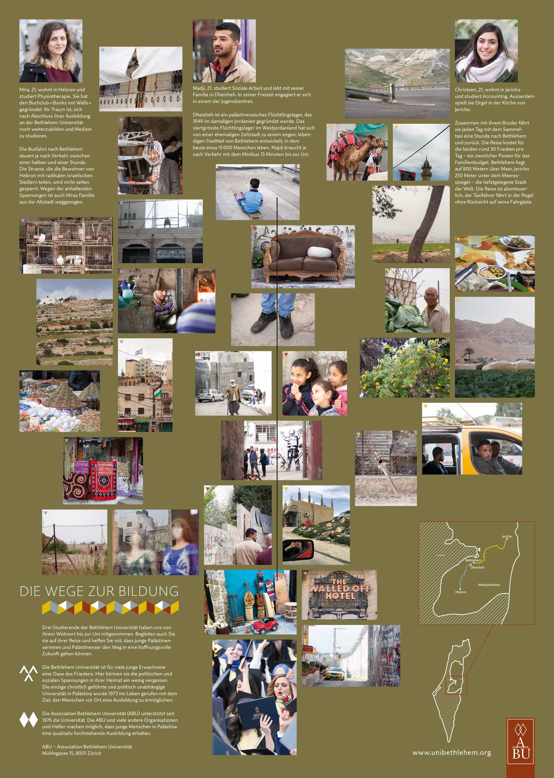
Both in reality and on the poster, the paths and images are partially cut.
More projects: