Cost of Living
Comparison of European Countries


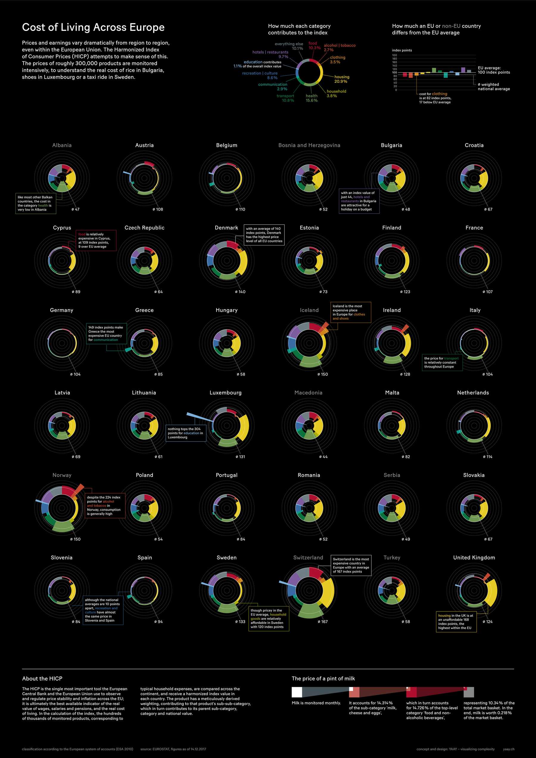
At superdot, we came across a stunningly detailed table based on the Harmonised Index of Consumer Prices (HICP).
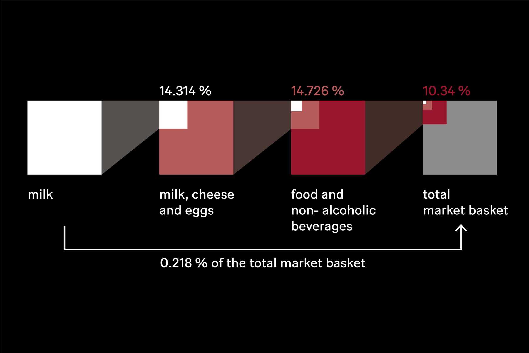
The HICP is an attempt to make sense of the dramatic differences in prices and earnings across Europe. Milk is just one example of the roughly 300,000 products monitored in the HICP basket.
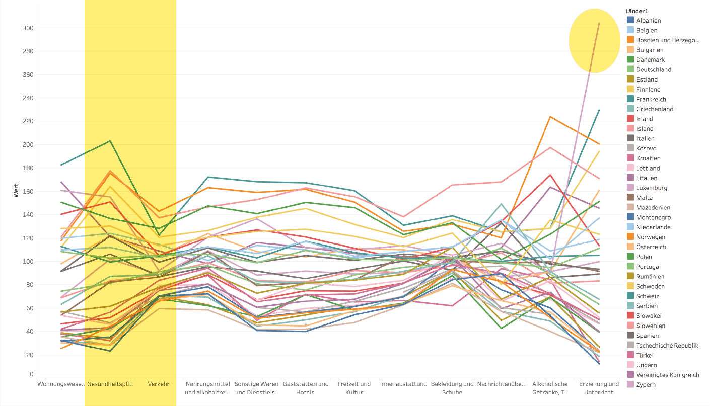
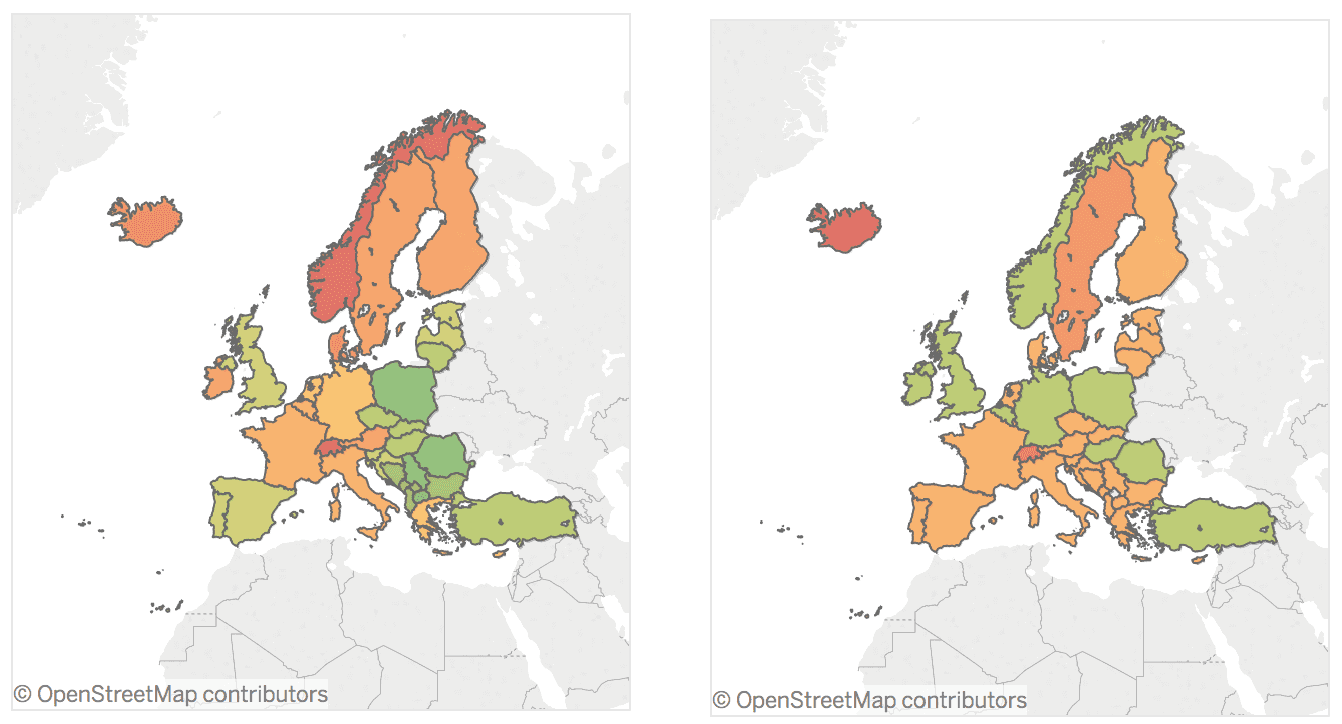
First I had to make sense of the dataset. Tableau is great for exploratory data analysis. You can see trends, such as greater variation in health than in transport, and outliers, such as the price of education in Luxembourg. The north-south, east-west divide is obvious on a map.
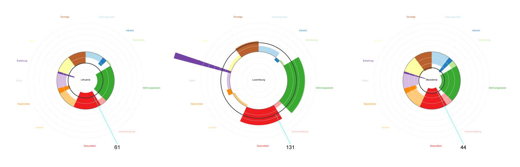
After much pen and paper sketching, a new type of chart emerged: a hybrid of a polar area chart and a pie chart, focusing on the deviation from a group mean. We can show the price for each category with the radial distance from the mean, and the weight of that category with the central angle. Slices pointing inwards correspond to a below-average index value and those pointing outwards to an above-average or ‘expensive’ index value.
In a somewhat unusual but fruitful workflow, I generated the SVG structure of the charts in JavaScript using D3 before exporting to Adobe Illustrator for proper styling. The final output is a poster giving a detailed overview of the cost of living in European countries. Some notable findings are highlighted, but there are many more details to explore, so take your time ...
You can read the full article on Medium.
More projects: