Lonza
Icon System for Global Brand


Lonza is a global leader in life sciences with about 15,500 employees in 120 locations. Visual communication can easily get messy. This is problematic in a number of ways, particularly as corporate communication is a sign of internal commitment to transparency.
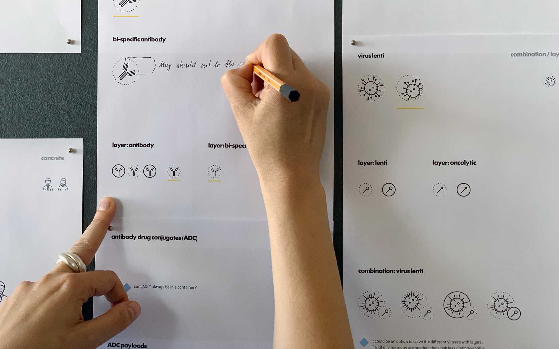
Superdot were asked to develop a robust icon system, modular enough to meet the needs of large-scale manufacturing and molecular biology without violating branding guidelines. There was a strong demand for scientific accuracy, even in the highly reduced look of the icons.
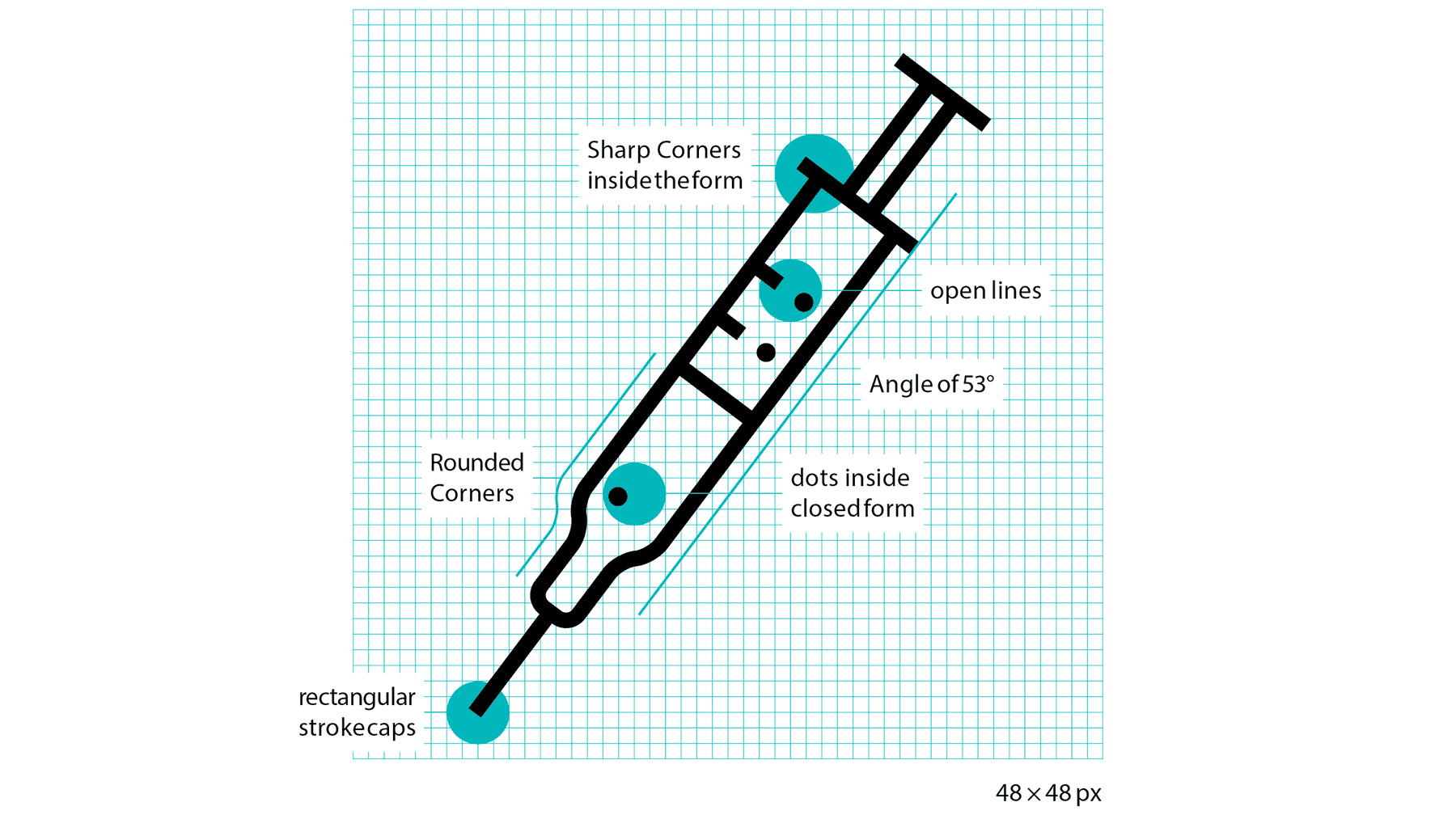
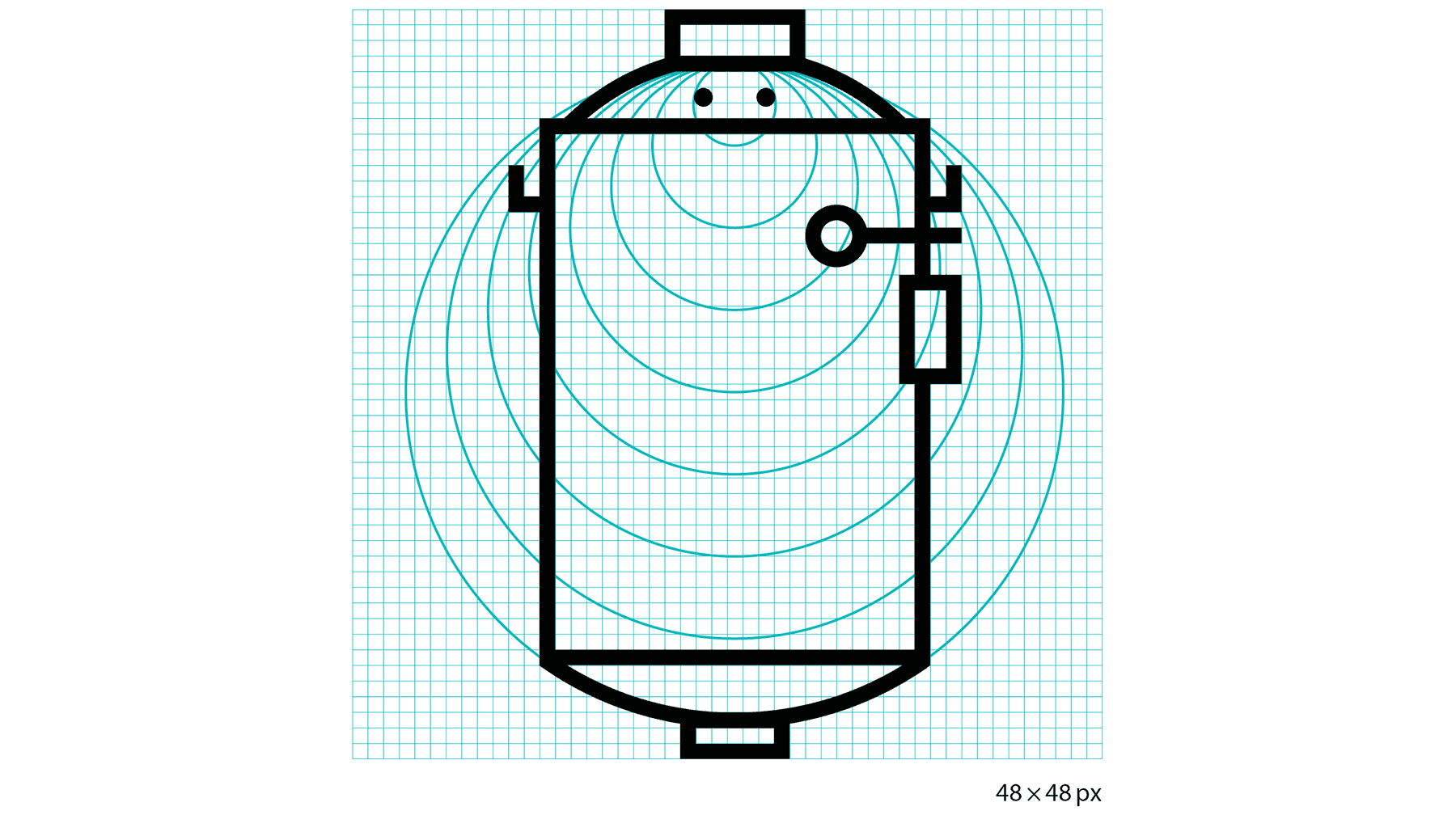
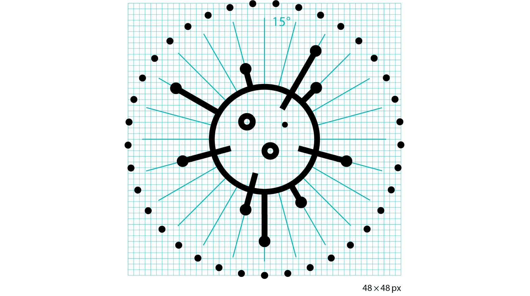
Based on the Lonza logo, I developed a geometric system with clear definitions for every angle, corner, line and point. With these guidelines, Lonza's graphics department can add more icons to their catalogue.
Each icon is pixel perfect, working on a scale of just 48 × 48 pixels. Optionally, an additional 24 × 24 pixel icon can be added to the bottom right. Icons can thus convey more complex concepts.

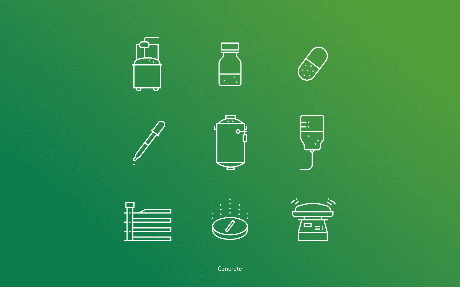
There are three categories of icons: concrete, abstract and microscopic. Because changing scale from concrete to microscopic is difficult to grasp, we introduced the dotted circle to symbolise the view through a microscope.


More projects: